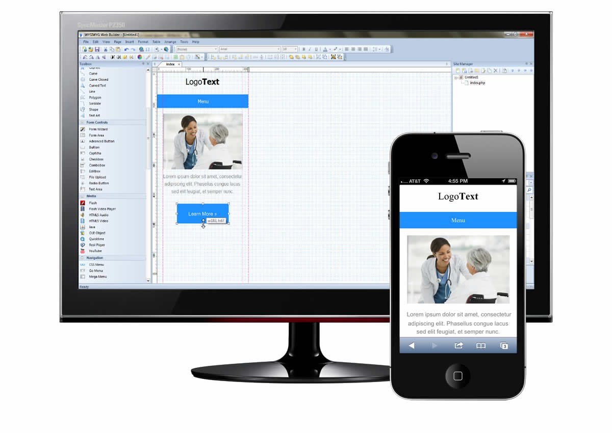
73% of people always keep their smartphones with them. The figure is taken from the Facebook research. According to Forrester research, 5 billion people around the world will use mobile phones in 2016.
The percentage of use of gadgets to access the Internet, surf the websites, use online payment services and make purchases is growing rapidly.
With the growth of visitors of websites from phones and tablets, the need to have really good and convenient site for companies has increased.
The person who comes to any website from his smartphone immediately leaves it if the site seems inconvenient or even ugly to him. In fact, you are losing a potential customer, the blog is losing a potential subscriber.
And the web developers have a great dilemma for now. What type of design should they use to build a website for mobile?
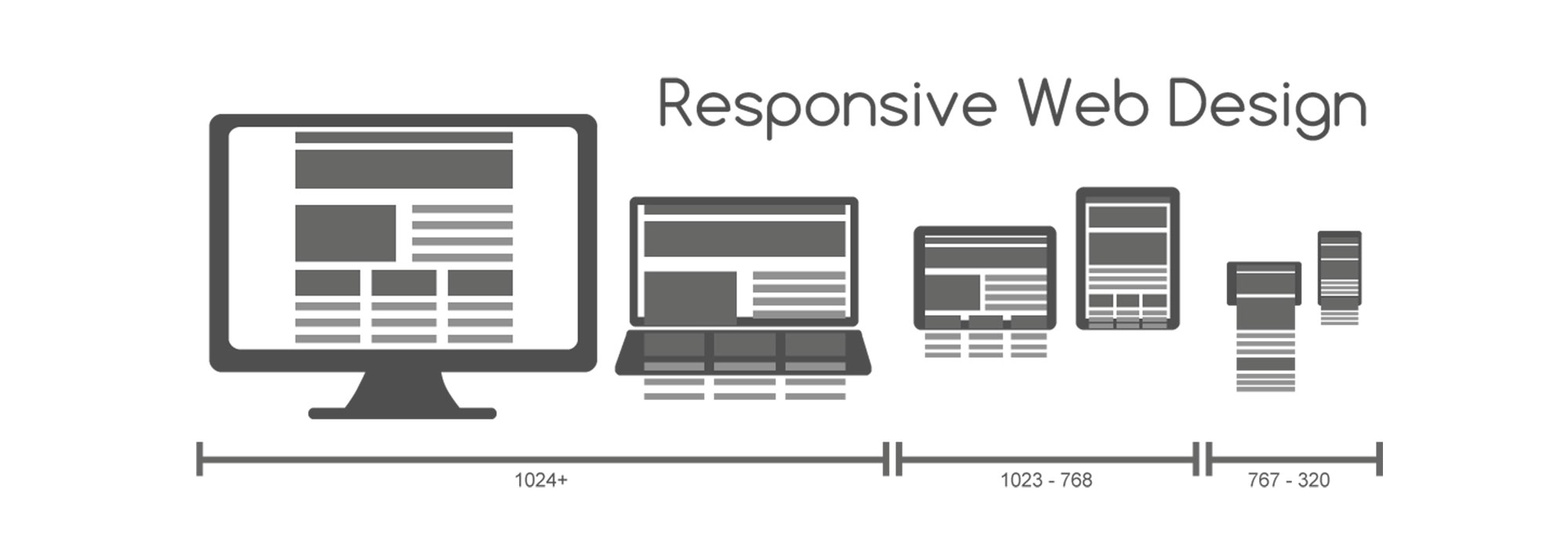
At the moment, there are few most common methods in design for creating websites for mobile devices. They are adaptive web design (RWD), separate mobile version on its own subdomain and also RESS (an acronym for RWD + Server Side). Let’s explore each of them below.
Responsive web design
 Developers typically use CSS3 Media Queries to create a site for mobile with RWD. The user will see a different picture depending on the size of his screen.
Advantages of the method:
- Ease of development. There`s no need to write the website from scratch, to create a mobile website with RWD you need to edit CSS and HTML files of your desktop site version.
- One address. RWD allows you to use the same address for the desktop website and mobile version of the site. Even a subdomain is not needed when implementing a website with RWD.
Disadvantages of RWD:
- Different user tasks. Use cases differ in desktop and mobile versions of the site. Usability suffers and the site remains to contain a lot of useless sections and functionality for smartphone users.
- Slow loading. Sites load rather slowly with responsive layout. This is due to their big size. Active elements, embedded maps, videos, animations and other inserts hold up downloading. It can scare the user with a bad mobile Internet or limited Internet traffic.
A separate mobile version of the site
[announce]
Usability of the site in this method changes completely compared to the desktop version. Changes of the created mobile page are focused on the use case for users with small screens and touch controls.
The site URL is often placed on the subdomain, for example, m.somedomain.com or mobile.somedomain.com
Advantages:
- It’s easy to make changes. The mobile version of the website is separate from the desktop version.
- User convenience.
- Download speed. Lightweight separate mobile versions of sites load faster than heavy desktop versions.
Disadvantages:
- Several addresses. Subdomain or other URL negatively affects on the search engines. In addition, it is inconvenient for the user to remember two URLs.
Finally, RESS
 RESS means RWD + Server Side.
Google uses this method for creating mobile sites and its own products for smartphones. If you go to the main page using different UserAgents, you can see different HTML for different devices.
This method may include advantages like separate mobile and adaptive versions of sites at the same time. It all depends on implementation.
Advantages of RESS:
- Minimizing traffic. You can remove unnecessary FavaScript code from HTML. This frees up CPU resources, memory, and cache on the mobile device. HTML and CSS may also be specifically optimized.
- You may offer to download the application from GooglePlay for Android devices and from iTunes for Apple. You can make your design for each device.
Disadvantages of RESS:
- Complex development. This method requires configuration of the server and the work of a large number of programmers. Also, you need to do a few different options for the layout.
- Mechanism of determination of devices. Unfortunately, identification of a device is not yet perfected even in our time. Sometimes mobile phones are not defined as gadgets with a small screen.
Summing up it is worth saying that for your own specific needs in functionality you need to use specific tools. If you need to hammer a nail you need a hammer. To hammer a nail with a screwdriver is meaningless.
Automatically created mobile version of website
The alternative may be one of the resources which help to create sites for smartphones automatically or using templates and just a few mouse clicks.
These resources were very popular in the era of the Wireless Application Protocol (WAP). The Internet was slow. GSM network was used for data transmission. Most of the websites made by such resources were text based and minimally decorated graphically due to low Internet speed.
Such instruments have considerably grown for our time. Now they are able to pick generally quite good functionality for the mobile version of the site and relatively well draw it graphically.
So, the conclusion.
Every day people are using their smartphones to access the network. Therefore, the mobile version of the website needs to be. It leads to an increase in traffic on the resource, in sales quantities, subscribers growth.
How to make a website for mobile? Simple.
You may create it by yourself or use special automated resources. But this site will be far from the ideal and may show the error message at any time. It is better to entrust the creation of a mobile website to the professionals.
Letzgro is the perfect team which can help you to create your mobile website thanks to their great experience. Just visit our contacts


